JUNE 2026 — Edition #5

the

pixel

insider
by WEB DESIGN TEAM

June was about consistency and scale. As more internal tools started sharing the same needs, we focused on the foundations behind them: reusable components, clearer production guidelines, cleaner outputs, better image-generation flows and editorial modules that support both user experience and SEO. The work was less about one isolated feature and more about making future delivery easier.
Blog Author Module
KNOW MORE +
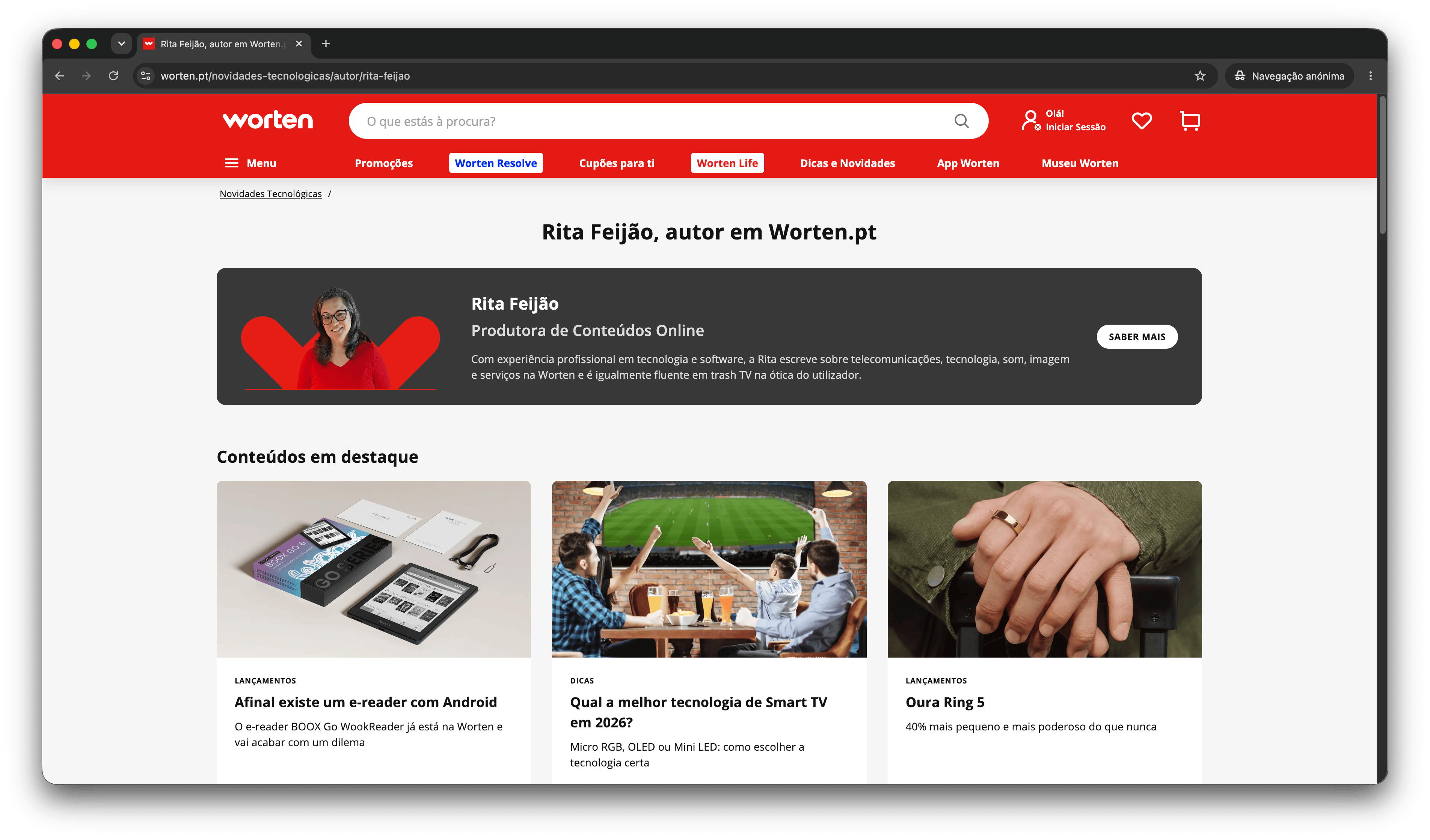
Blog SEO Editorial Structured Data
Blog Author Module
Problem
Author information in blog articles needed a more consistent visual and technical structure.
Solution
We developed a new Blog Author module with desktop and mobile styles, plus structured data support for articles and author profile pages.
Impact
The module improves editorial clarity, reinforces author visibility and supports better SEO structure across blog content.
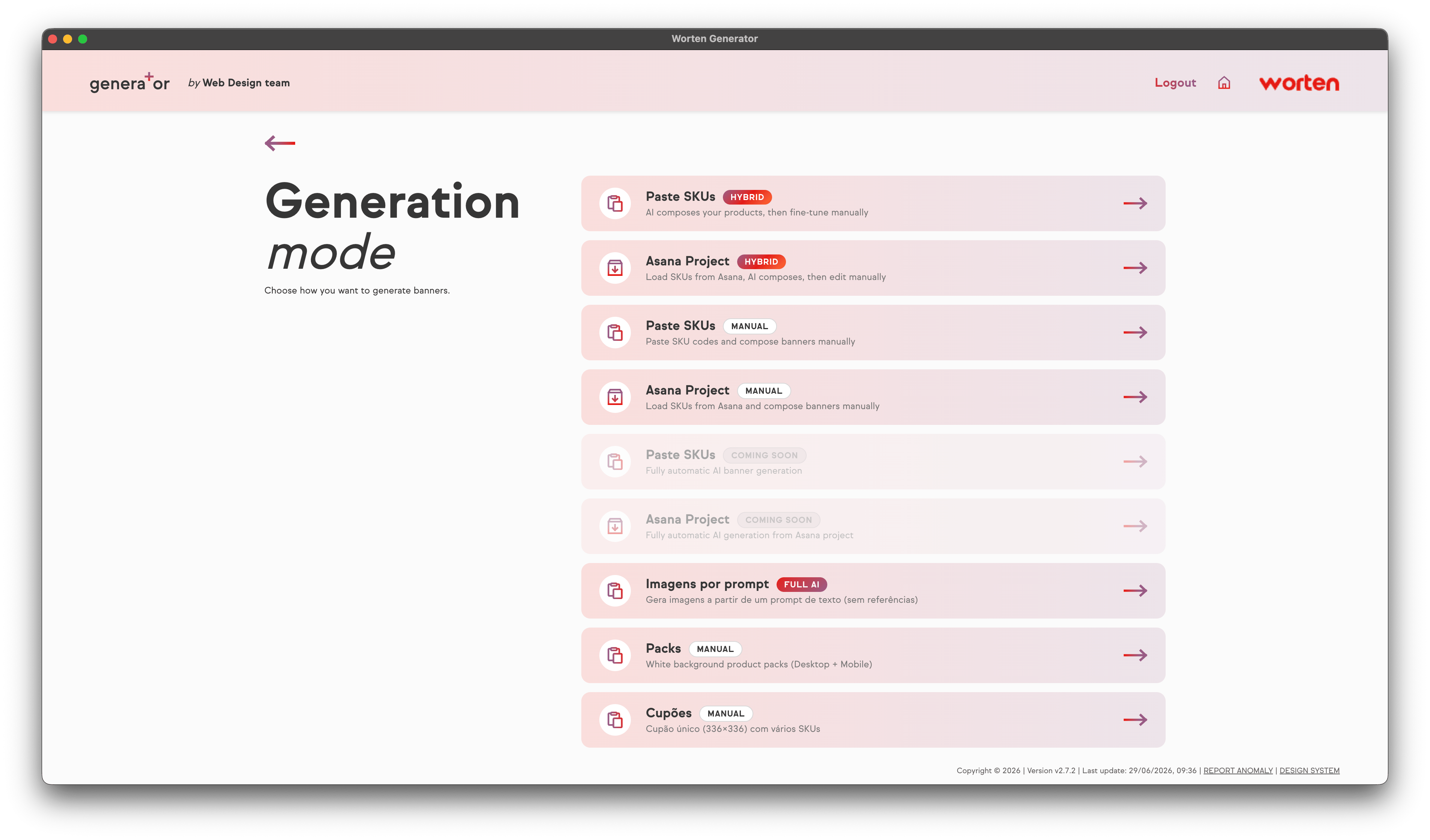
Prompt-based image generation
KNOW MORE +
AI Image Generation Asana Automation
Prompt-based image generation
Problem
Some image requests did not need a full SKU-based workflow, but still required a faster way to create visuals for campaigns and Asana projects.
Solution
We added a simpler prompt-based image mode that can work with or without SKUs, returning generated images directly into the project workflow.
Impact
This gives the team a faster option for visual exploration and helps reduce dependency on slower, more manual image sourcing processes.
Shared Design System foundations
KNOW MORE +
Design System Components Internal Tools Scalability
Problem
Internal apps were starting to share the same interface needs, but each project still risked solving buttons, cards, modals and inputs separately.
Solution
We started consolidating shared foundations so future tools can reuse the same visual and interaction patterns.
Impact
This makes apps more consistent, easier to maintain and faster to develop, especially when different developers work on related tools.
Making banner guidelines operational
KNOW MORE +
Guidelines Banners Design System Production UX
Problem
The previous banner guideline worked mainly as a visual reference, but some information was harder to consult quickly, especially around formats, safezones, logos, SKUs and current versus legacy rules.
Solution
We evolved the guideline into a more operational production guide, organised by banner format and rule type, with clearer safezones, hierarchy, logo limits, SKU areas and desktop/mobile behaviour.
Impact
This makes the guideline easier to use by designers, marketing and other teams, reducing wrong briefs, layout doubts and inconsistent banner production.
Image editor improvements
KNOW MORE +
Image Editor Layers UI Workflow
Problem
Image editing inside internal tools was becoming more complex, with repeated needs around shadows, rotation, colour, ordering and layer control.
Solution
We reviewed the editor logic and started preparing it as a reusable part of the internal app ecosystem.
Impact
This helps avoid rebuilding advanced editing controls in every project and creates a stronger base for future image-related tools.
Bruno Biscaia
Bruno Biscaia
Banner guidelines and production clarity

Helped evolve the banner guidelines from a mainly visual reference into a more practical production guide, with clearer rules for formats, safezones, logos, SKUs, hierarchy and desktop/mobile behaviour.

Francisco Ferreira
Francisco Ferreira
App implementation

Shared detailed updates on the FAQ App, Wizard Services Pages and related implementation work, helping transform technical progress into clearer product stories for the team newsletter.

👤
Web Design Team
AI-assisted creation

Continued testing how AI can support image generation, content creation and operational workflows, while keeping the focus on practical outputs that help the team deliver faster.

Team Activity
June was less about isolated releases and more about strengthening the base behind the team's tools and production rules. Work continued across service pages, image workflows, editorial modules, shared interface patterns and banner guidelines. The main priority was to reduce ambiguity, duplication and repeated setup.
01
Shared patterns compound

A small reusable component can save time across several future projects.

02
AI needs workflow design

Good results depend on how inputs, prompts and review steps are structured.

03
Technical work needs translation

The value of a tool is clearer when we explain the problem it removes.

04
Guidelines must answer real questions

A good guideline should quickly explain what format to use, where content can go and which rules cannot be ignored.

📦
Code Sharing
Preparing shared repositories

The next focus is to separate reusable parts of the internal apps into shared repositories, making it easier for developers to import, improve and reuse common logic.

🛒
PDP
Moving towards richer PDP content

We will also start connecting product data, generated visuals and HTML templates into a more structured flow for enriched product detail pages.

📐
Guidelines
Turning references into tools

We will continue improving guidelines so they are not only visual references, but practical production tools that help teams make faster and more consistent decisions.